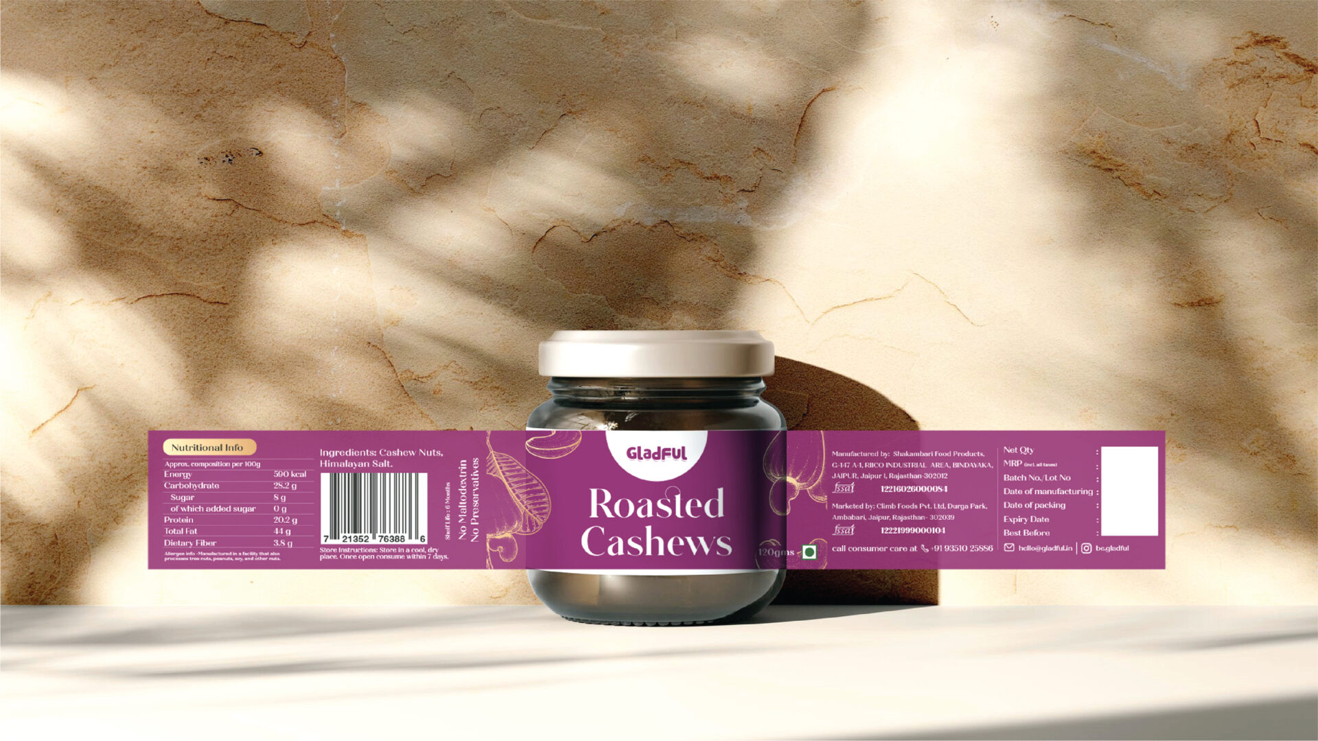
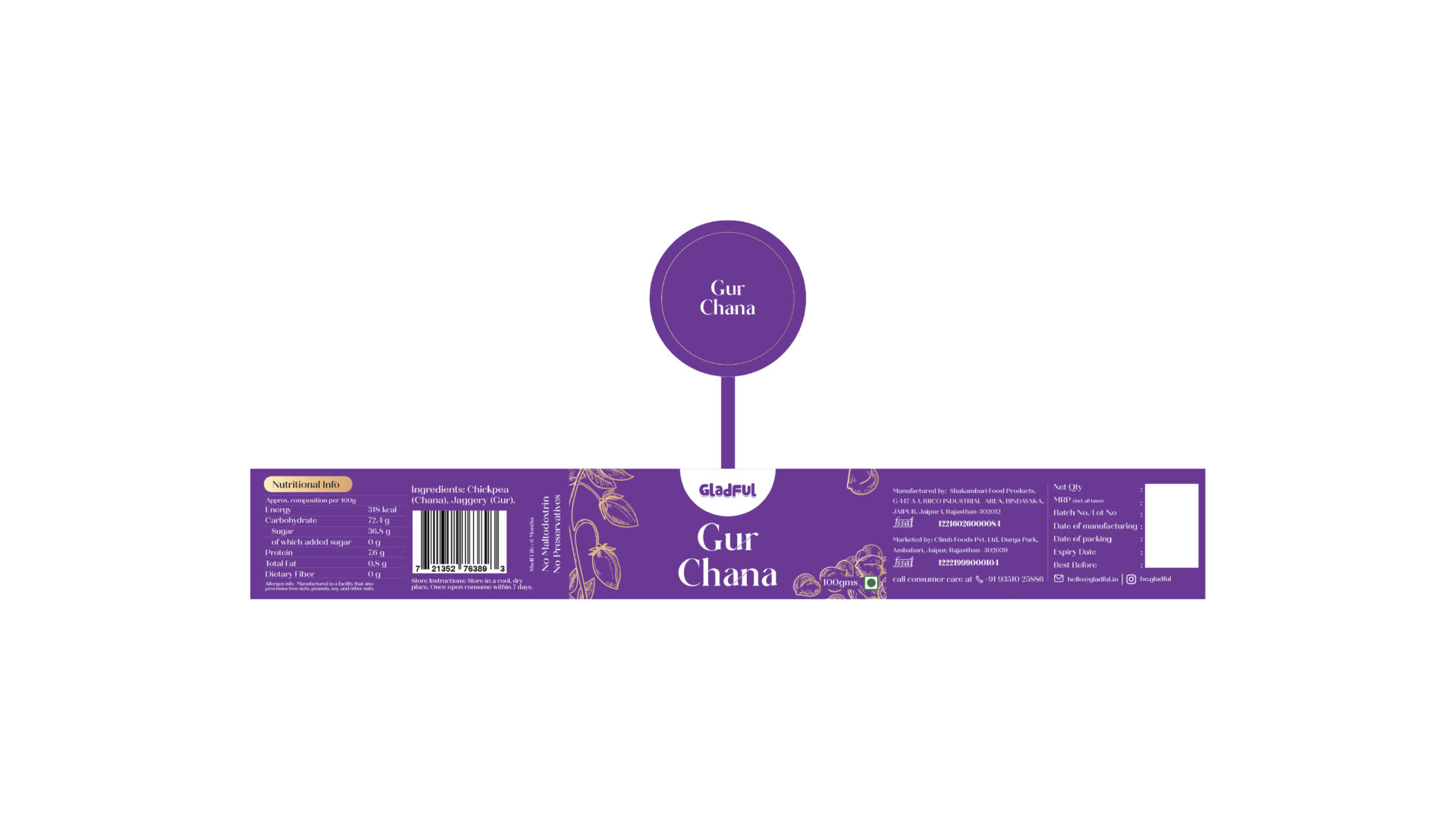
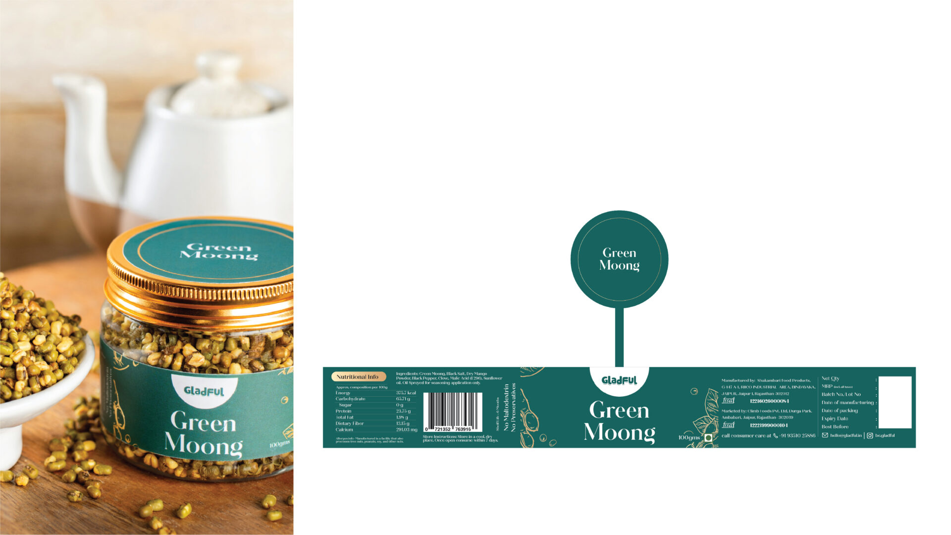
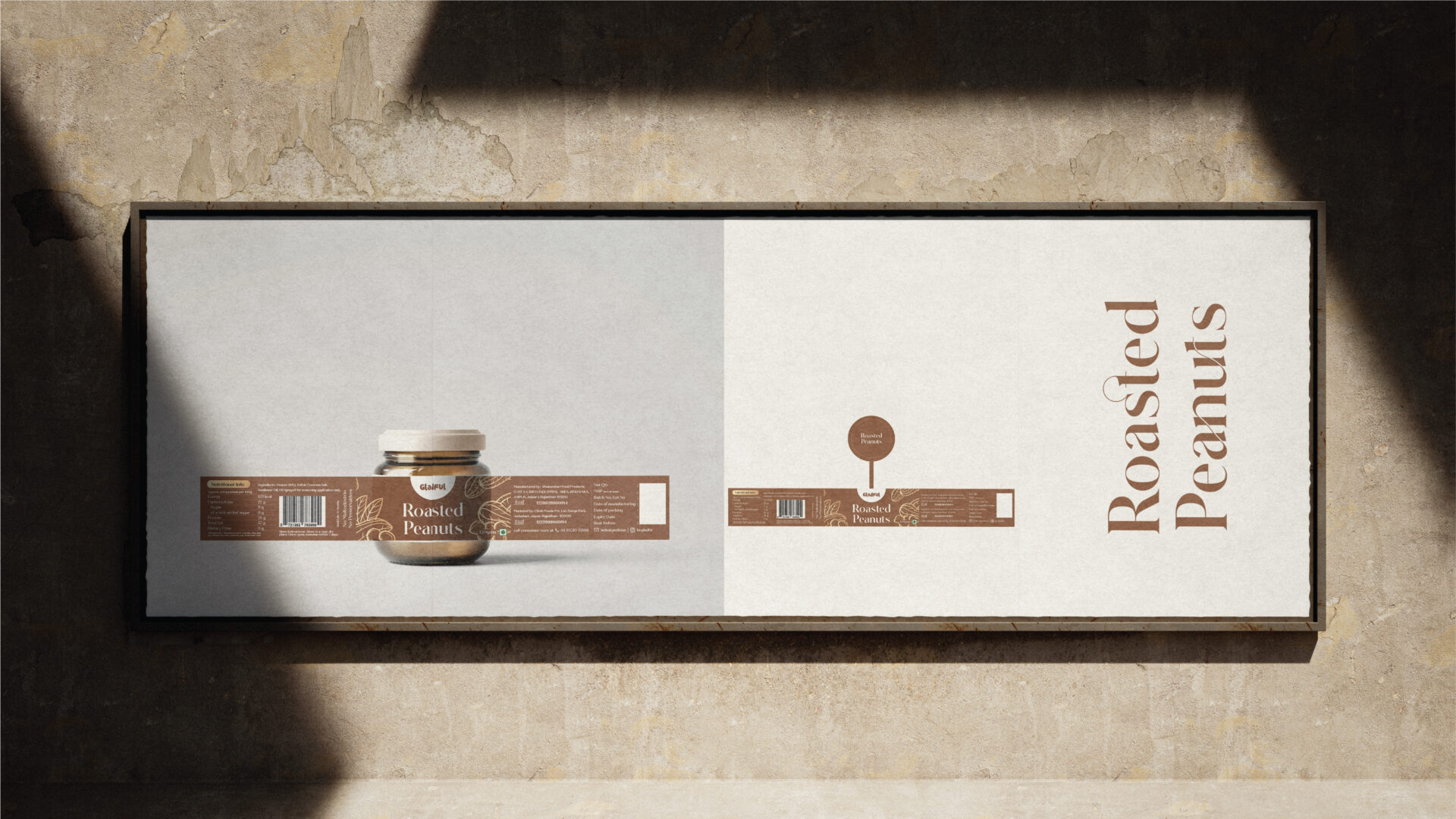
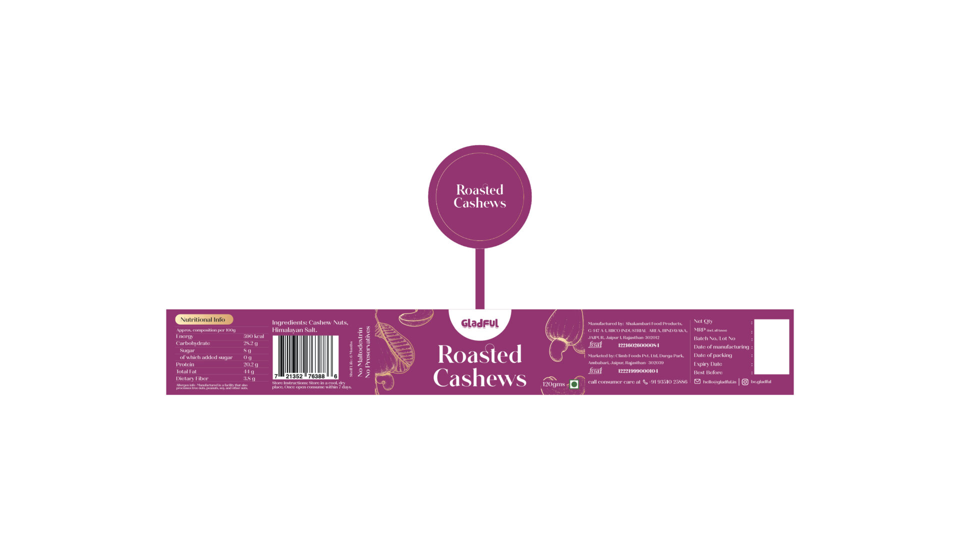
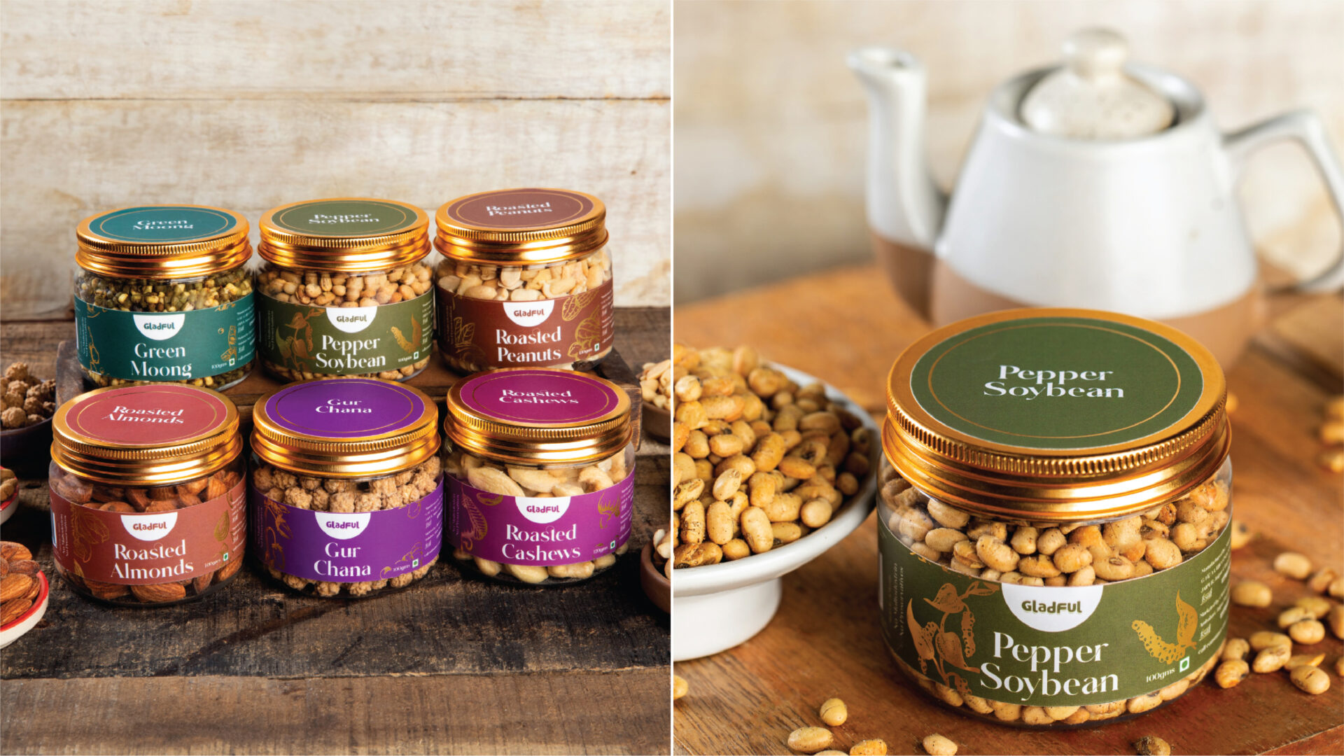
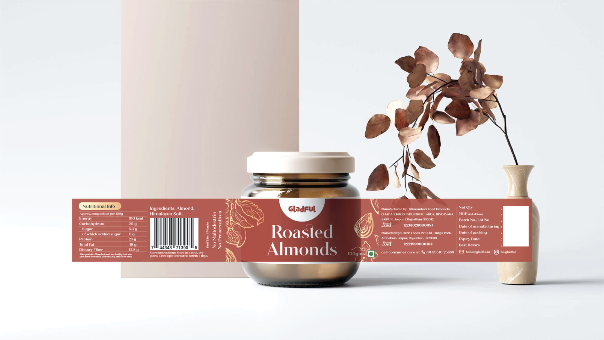
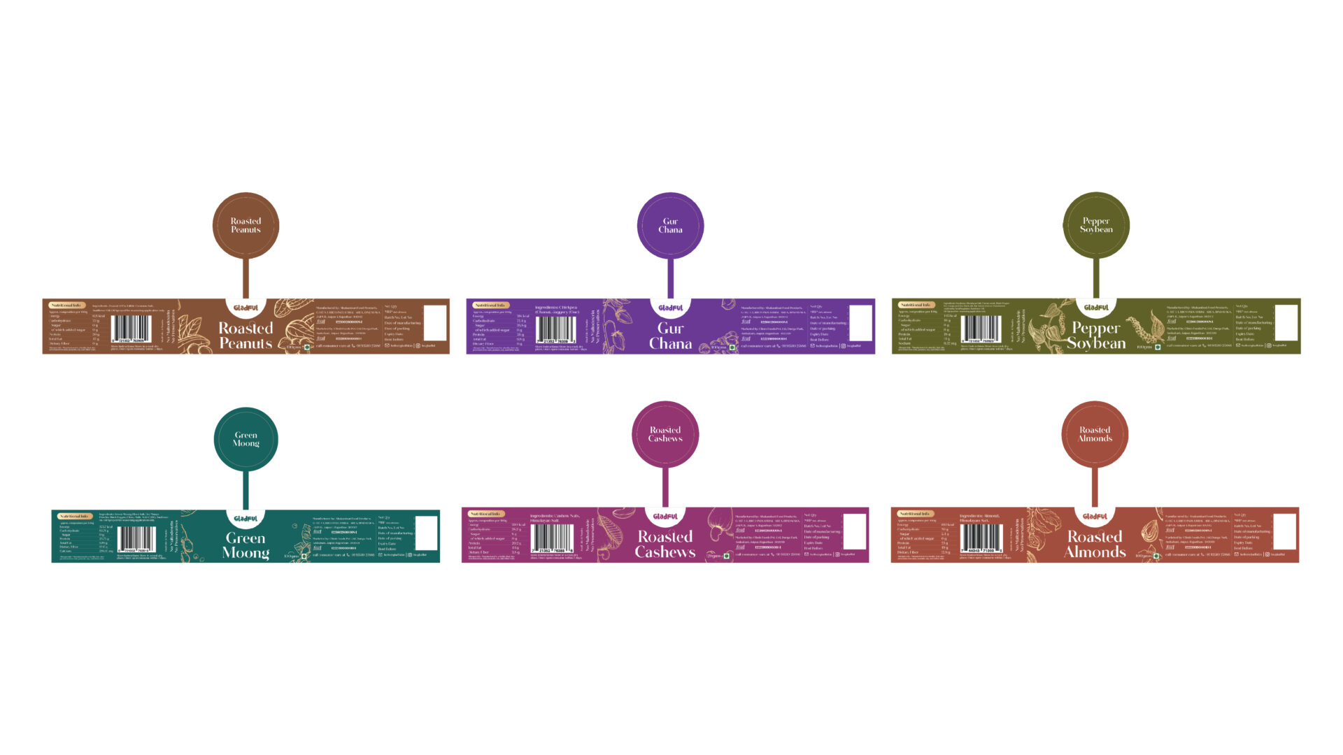
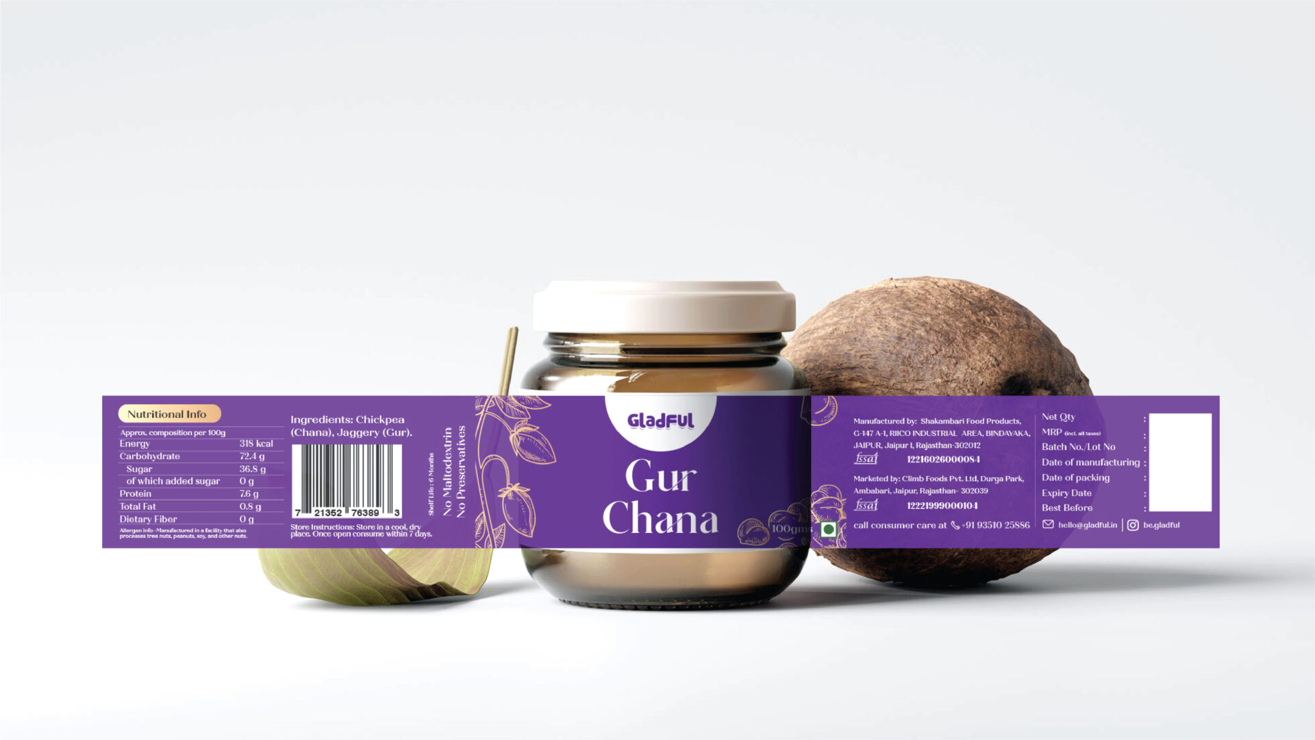
The luxury packaging designed for the Gladful brand exudes opulence and sophistication, creating a visual experience that complements the premium quality of the pulses and dry fruits within. The choice of a rich, golden color scheme lends an air of exclusivity and luxury to the packaging, immediately catching the consumer’s eye and communicating the high-end nature of the products. The golden hue symbolises not only the premium quality of the contents but also evokes a sense of abundance and prosperity, making it an ideal choice for a brand that specialises in pulses and dry fruits.
In addition to the golden color, vibrant hues have been strategically incorporated into the design, adding a lively and dynamic element to the overall aesthetic. These vibrant colors serve to highlight the freshness and variety of the products, creating a visually appealing contrast against the luxurious golden backdrop. The combination of opulent gold and vibrant colours not only enhances the shelf presence of the Gladful brand but also elicits a positive emotional response from consumers, associating the act of purchasing these products with joy and satisfaction.
The packaging design, crafted by jaheratdesign, reflects a keen understanding of the brand’s positioning in the market and the expectations of discerning consumers seeking a premium experience. The thoughtful use of colours, along with meticulous attention to detail, results in packaging that not only protects the integrity of the pulses and dry fruits but also elevates the overall perceived value of the Gladful brand.


