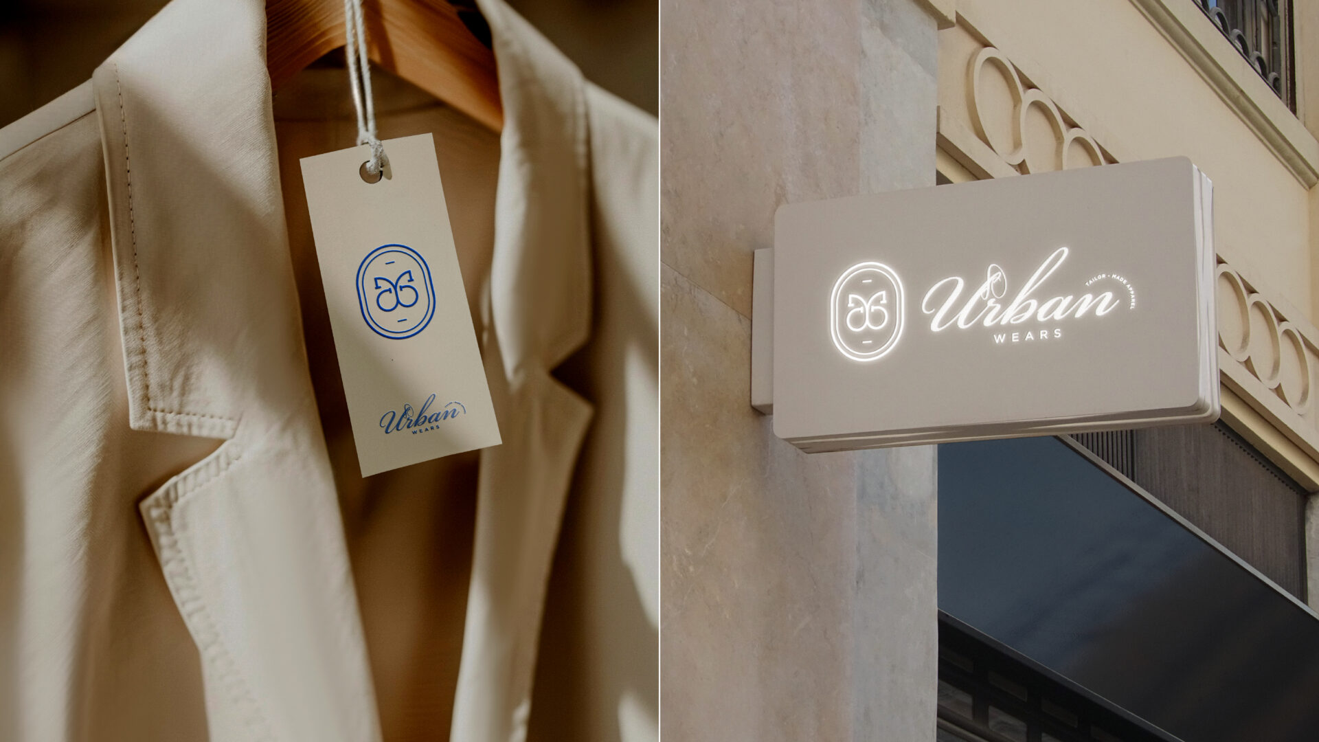
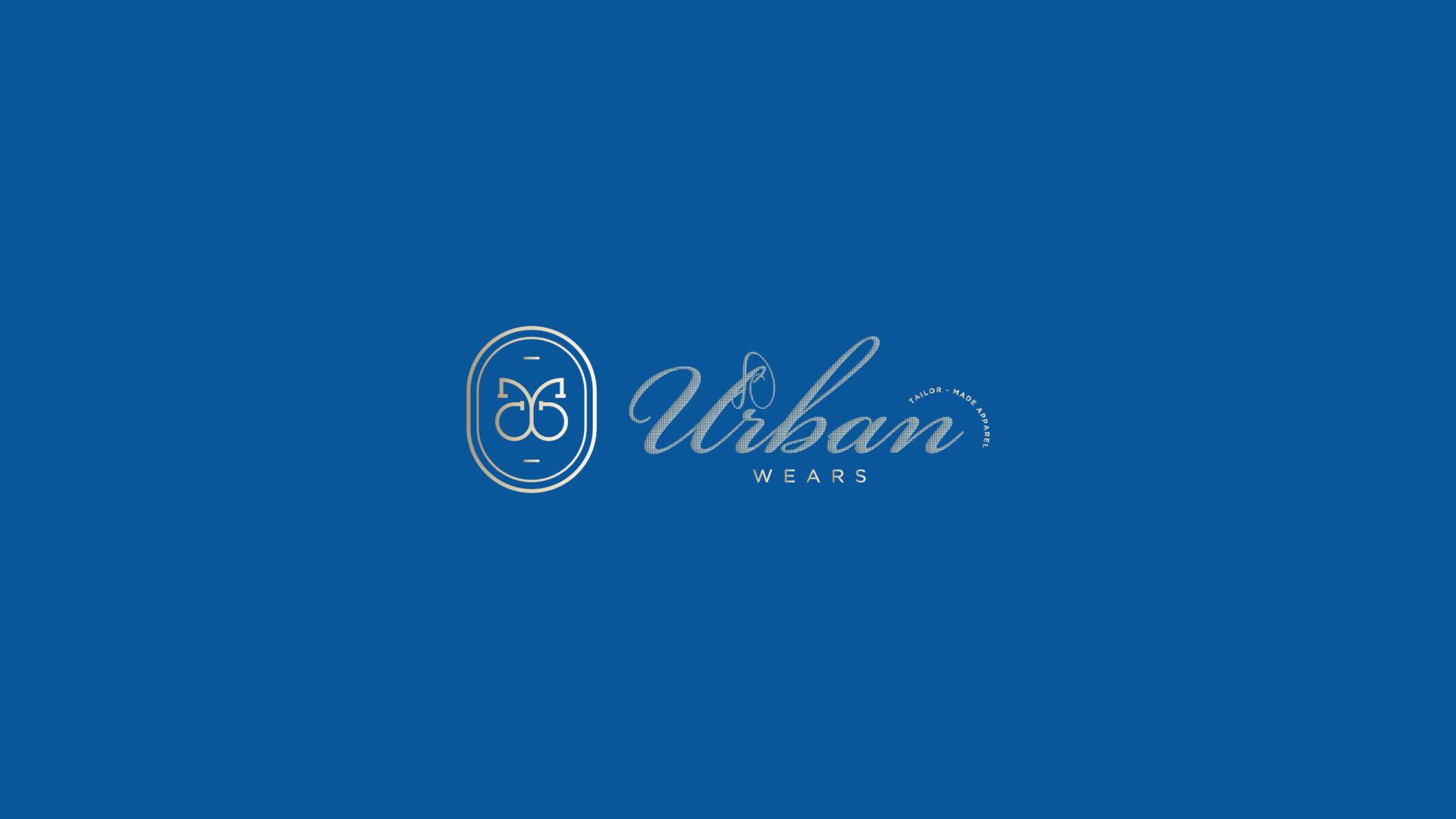
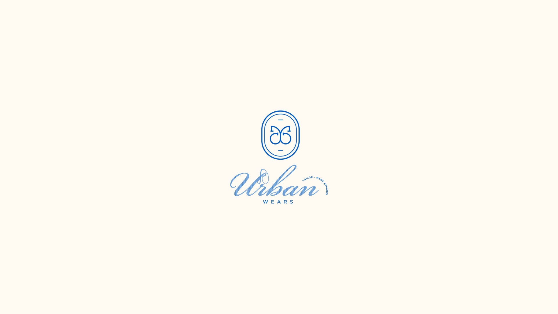
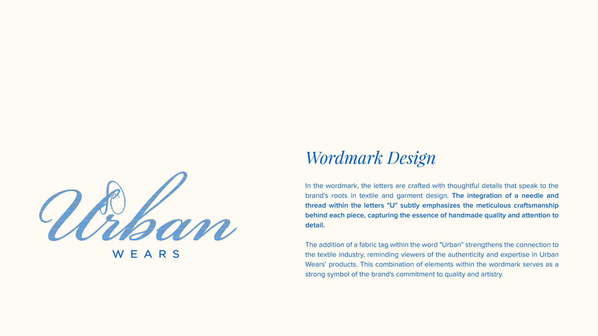
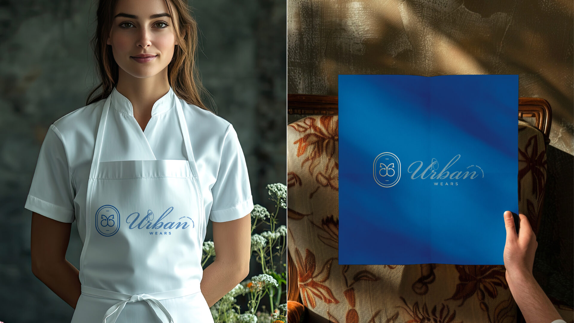
Wordmark
The UrbanWears wordmark is designed to reflect the brand’s deep roots in the textile and garment industry. Thoughtful elements such as a needle and thread subtly integrated into the letter “U” highlight the precision and craftsmanship that define the brand’s offerings. The inclusion of a fabric tag in the word “Urban” strengthens its association with the textile industry, symbolizing the authenticity and reliability of UrbanWears’ products. The clean, professional typography conveys trustworthiness, quality, and the brand’s unwavering commitment to excellence.
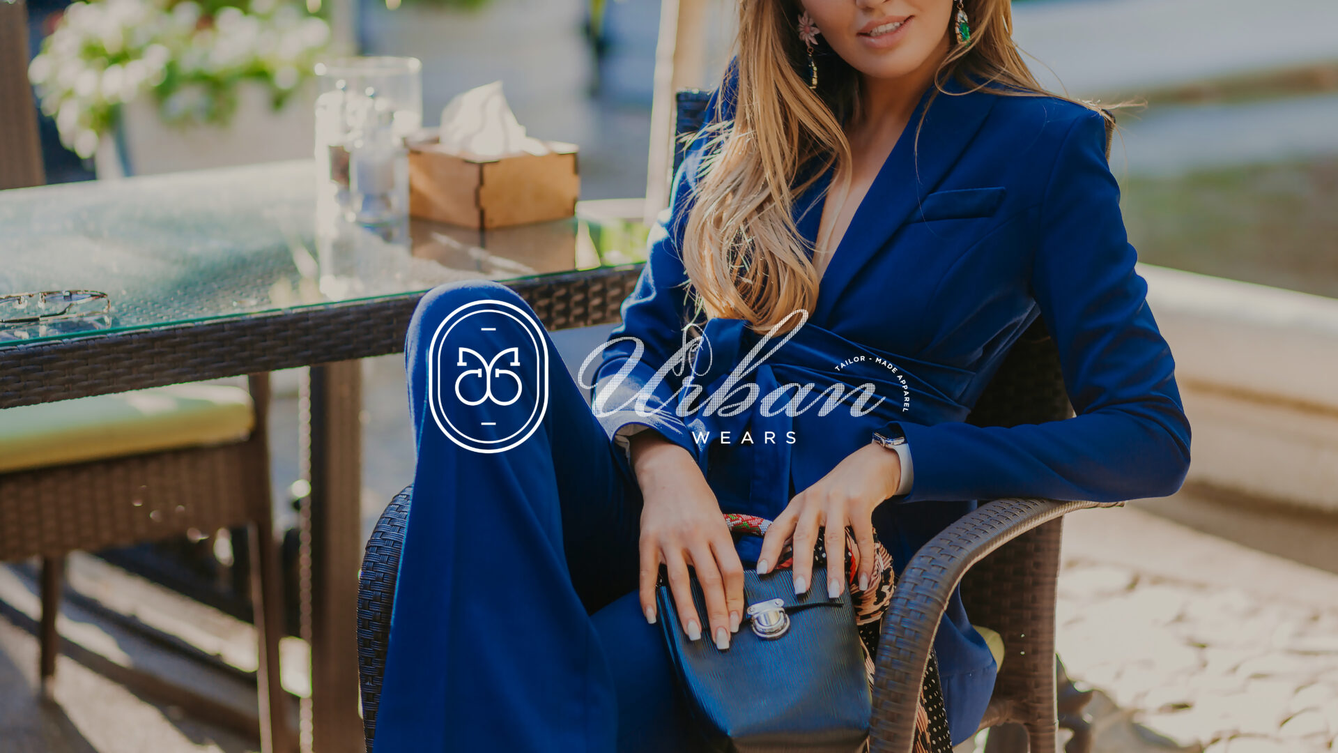
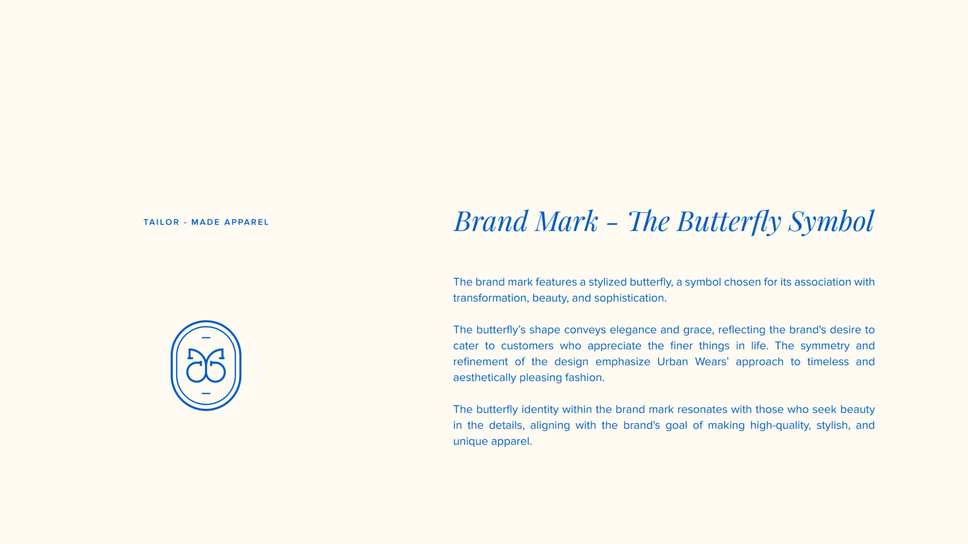
Brand Mark
The brand mark features a stylized butterfly, a symbol chosen for its association with transformation, beauty, and sophistication. The butterfly’s design exudes elegance and grace, resonating with clients who value high-quality and aesthetically pleasing fashion. Its symmetry reflects the balanced, meticulous approach UrbanWears takes in its design and production processes, aligning perfectly with its mission to provide stylish and timeless apparel.
Brand Meaning
The butterfly signifies the brand’s transformative impact on its clients’ uniform and apparel needs, emphasizing creativity and sophistication. The needle and thread in the wordmark serve as a tribute to UrbanWears’ dedication to intricate craftsmanship and attention to detail, reinforcing its professional and trustworthy identity.
Color Palette
UrbanWears’ color palette is carefully chosen to reflect professionalism, reliability, and creativity:
Navy Blue: Represents trust, quality, and sophistication, establishing a strong connection with corporate and professional audiences.
Silver: Symbolizes innovation and modernity, resonating with the brand’s ability to cater to contemporary fashion needs.
White: Reflects purity, precision, and the brand’s commitment to clean and efficient production.