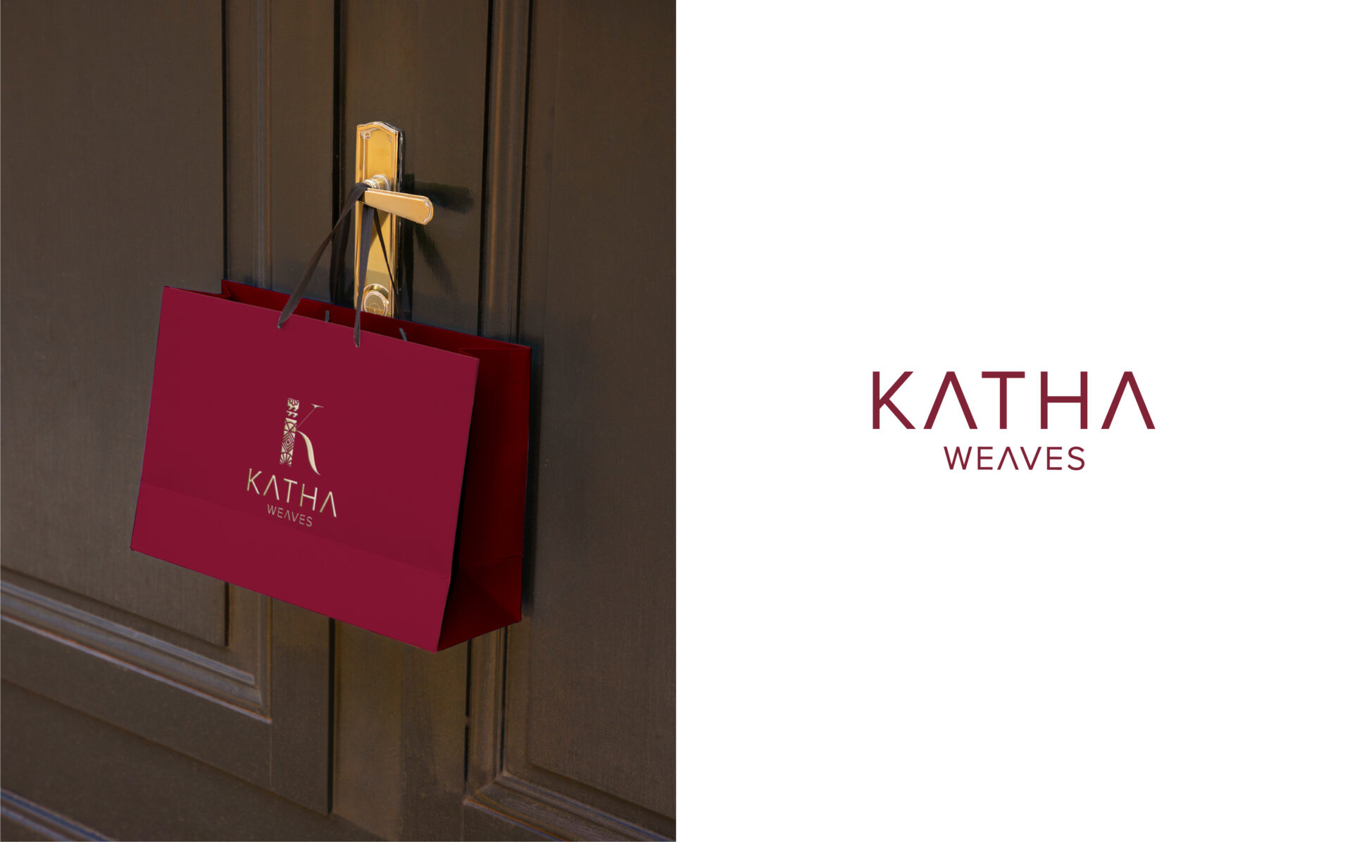
Logo Design: Katha Weaves’ logo is a blend of artistic symbolism and cultural heritage. The letter “K” is intricately adorned with a quill pen, sea shell, needles, ocean waves, and natural shapes, creating a visually compelling representation of craftsmanship and storytelling inherent in Indian sarees.
Color Palette: The color scheme of maroon and gold embodies Katha Weaves’ essence. Maroon symbolizes tradition, passion, and the richness of Indian textiles, while gold accents add a touch of elegance and luxury, reflecting the brand’s commitment to quality and sophistication.
Brand Ethos: Katha Weaves epitomizes the fusion of tradition and innovation in saree craftsmanship. Each creation celebrates the artistry of weaving, weaving narratives of cultural heritage and contemporary design into every thread.
Voice and Tone: Katha Weaves communicates with a voice that is both poetic and authoritative, weaving tales of craftsmanship and beauty. The tone is warm and inclusive, inviting customers to discover the timeless elegance and cultural significance embodied in each saree. Katha Weaves appeals to discerning individuals who appreciate the artistry, heritage, and elegance of Indian sarees. The brand caters to fashion enthusiasts who seek to embrace tradition with a modern twist, celebrating the craftsmanship and stories woven into each piece.


